Small rooms don’t have to feel cramped, and the right paint choices are often the most affordable fix available. Interior painting ideas for small spaces go well beyond picking a light colour. They draw on colour psychology, light reflection science, and, for Cape Town homeowners, a genuine understanding of how humidity affects paint performance. This guide covers all three, with practical room-by-room advice at the end.
Why Color Psychology Matters in Small Rooms
How the brain reads color and space
The brain interprets a room’s size partly through visual cues, and paint colour is one of the strongest. Hue, saturation, and value (lightness) all play a role. High-value colours, those closer to white on the brightness scale, reflect more light back into the room, making walls feel further away. Low-value, highly saturated colours absorb light and pull surfaces visually closer.
Colour consultants consistently recommend high-LRV (Light Reflectance Value) neutrals, off-whites and pale greiges, as the most reliable way to make a compact room feel more open. They bounce natural and artificial light without creating visual noise, so the room reads as bigger without looking clinical.
Warm vs. cool tones: which opens a room?
Cool tones, soft blues, pale greens, and grey-tinted whites, visually recede. They push walls back. Warm tones, terracottas, rich yellows, deep oranges, advance, drawing walls inward. In a small room, that distinction matters.
Warm tones aren’t automatically off-limits, though. A warm, very pale greige can feel welcoming while still reading as spacious, because its high value offsets the warmth. The key variable is saturation: keep it low and most colours work. Push saturation high and even a cool blue will start to feel heavy.
Best Paint Colors for Tiny Spaces in 2026
Light paint colors that maximise the feel of a room
The strongest performers among paint colors for tiny spaces this year are off-whites with cool undertones, soft greiges, pale sage, and barely-there blues. They share a common trait: low saturation and high reflectance. They read as almost neutral in natural light but carry just enough personality to avoid the sterile look of a pure white room.
Pale sage suits rooms that catch morning light well, the green undertone shifts green-gold in warm light, which adds depth without weight. Barely-there blues work in south-facing rooms that receive cooler, indirect light, where they calm rather than chill the space.
For ceilings in small rooms, a white one or two tones lighter than the wall colour pushes the ceiling up visually. It costs nothing extra.
Strategic use of color schemes for small rooms
Monochromatic schemes, one hue across walls, trim, and ceiling in slightly varied tones, are among the most effective color schemes for small rooms. By removing contrast between surfaces, the eye doesn’t stop at each boundary. The room reads as a unified volume rather than a box of separate planes.
A practical local example: a narrow Cape Town townhouse bathroom repainted in soft sage eggshell, with matching trim in a slightly lighter tint of the same colour, unifies all surfaces and removes visual clutter. The room reads larger because there are no sharp colour breaks telling the brain where one surface ends and another begins.
The same principle applies to small commercial interiors, a boutique, a small office, a studio. Commercial painting contractors in Cape Town can advise on brand-appropriate palettes that still use these space-enhancing techniques.
Light Reflection Tips: Finish, Sheen & Surface Prep
Choosing the right paint sheen for small spaces
Sheen level directly affects how much light a painted wall throws back into the room. Satin and eggshell finishes reflect noticeably more light than flat or matte finishes, making them the preferred sheens for small interior walls, a recommendation that appears consistently across major paint manufacturers’ specification guides, including those from Plascon and Dulux SA.
Flat paint scatters light broadly rather than reflecting it directionally. That softens the look but reduces brightness. In a small room that already lacks natural light, this trade-off rarely pays off. Use eggshell on walls, satin on trim and joinery, and a low-sheen ceiling white overhead. This layered approach adds subtle dimension while maximising light bounce at every surface.
Surface prep and how it affects light bounce
An uneven wall surface, filled poorly, sanded unevenly, or with old paint ridges still visible, breaks up the reflective plane. Light hits at inconsistent angles and the wall looks patchy rather than bright. Thorough surface preparation is therefore not just about aesthetics; it directly affects how well the chosen sheen performs.
The process matters: fill all cracks and holes, sand flush, apply a suitable sealer or primer, and sand lightly again before the final coat. Professional house painting services in Cape Town include this preparation as standard, it’s the step that separates a paint job that looks good on day one from one that still looks good after two years.
Accent Wall Ideas That Expand Rather Than Shrink
A well-placed accent wall can add depth to a small room rather than closing it in, but placement and tone selection are critical. Place the accent wall on the shortest wall of the room, or on the focal wall you want to push back visually.
Painting a deep, muted tone, charcoal, dusty teal, or smoky navy, on the shortest wall of a small bedroom, then keeping the remaining three walls in a light complementary neutral, creates a strong sense of depth. The darker wall appears to recede, and the contrast makes the lighter walls feel further from the eye. The room gains perceived length.
Avoid placing the accent wall on a long side wall. This shortens the room visually and cancels the effect. Avoid high-gloss finishes on accent walls in small spaces too, they reflect light erratically and draw too much attention to surface imperfections.
For narrow hallways, a single deeply toned end wall at the far end draws the eye forward and creates a sense of destination. Pair it with pale, continuous walls along the length of the hallway and keep the floor tone consistent to reinforce the tunnel effect in a positive direction.
Painting Small Spaces in Cape Town: Humidity & Moisture Considerations
Why Cape Town’s climate demands moisture-resistant paint
Cape Town’s wet winters and humid coastal air create conditions that standard interior paints handle poorly. Small, poorly ventilated rooms, bathrooms, laundries, compact kitchens, and rooms on the shaded north-facing side of a property, are especially vulnerable. The combination of trapped moisture and temperature fluctuation causes paint to blister, peel, and in persistent cases, develop mould beneath the surface.
Wilcote Cape Town’s residential painting teams regularly encounter moisture-related paint failure in small, poorly ventilated rooms across the Cape Peninsula, particularly after the winter wet season. The practical solution is to specify moisture-resistant or mould-inhibiting paint formulations in any room where condensation or damp is a recurring concern. Both Plascon and Dulux SA manufacture interior ranges with mould inhibitors that are widely available and appropriate for Cape Town conditions.
For rooms with a history of water ingress, rising damp in older properties, or seepage through external walls, painting alone is not sufficient. Addressing the source with waterproofing solutions for Cape Town’s wet season before repainting protects the investment and prevents the new paint from failing within a season.
Ventilation tips before and after painting
Good ventilation is essential both during application and in the weeks after. During painting, open windows and doors on opposite sides of the room to create cross-ventilation, this reduces solvent and moisture build-up and improves cure time. In winter, when Cape Town’s weather limits open-window options, a small fan exhausting air outward helps.
After painting, give the room at least 48–72 hours of ventilation before returning furniture to the walls and restricting airflow. Newly applied paint, even fast-drying formulations, continues to cure for several weeks. Trapping humidity against a fresh film slows this process and weakens adhesion.
Room-by-Room Interior Painting Ideas for Small Spaces
Small bathrooms perform best in light neutrals, off-white, pale greige, or a very muted sage, applied in an eggshell or satin finish for both moisture resistance and light reflection. Keep tile grout and trim tones close to the wall colour to reduce the visual fragmentation that makes small bathrooms feel cluttered.
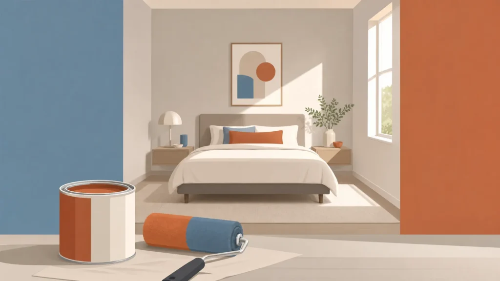
Compact bedrooms respond well to soft cool tones: pale blue-grey, muted sage, or a barely-there lavender. These colours lower visual stimulation, which supports the function of the room while keeping the walls from closing in. A monochromatic approach, walls, trim, and even bedlinen in the same tonal family, reinforces the calm and the sense of space simultaneously.
Narrow hallways benefit from a single, pale, continuous tone on all four walls. Avoid breaking the walls into dado and upper sections with contrasting colours, which adds horizontal bands that visually reduce ceiling height. To add character, use a slightly deeper tone on the end wall as an accent, or consider vertical panelling details painted in a tone-on-tone scheme.
For small-space challenges that go beyond what paint can solve, adding space with a home extension or working with home renovation contractors in Cape Town may be the logical next step alongside a fresh interior colour scheme.
If you’re planning an interior repaint and want advice tailored to your specific rooms, light conditions, and Cape Town’s climate demands, contact Wilcote Cape Town for a professional consultation or quote. Their teams work across residential and commercial properties throughout the Cape Peninsula and bring both colour expertise and local climate knowledge to every project.